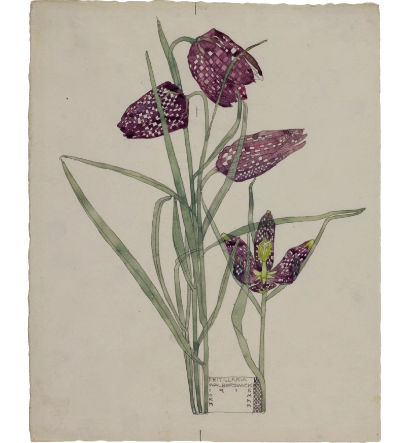


Ghostly stems weave between the four fritillaries in Charles Rennie Mackintosh’s delicate watercolour painting. The artist captures the characteristic dangling bell shape and purple-and-cream checkerboard pattern of the flowers. The shortest bloom is painted in a surprising pose, however: pointing upwards with its petals spread out. Mackintosh had a firm scientific understanding of plant forms and the ability to depict them with botanical precision. Just as important for him as this, though, was his desire to bring out the beauty of their design and decoration.
Fritillaria was created in an unusually fertile period of artistic making for Mackintosh. It followed two years during which he struggled in his work as an architect and became increasingly dependent on alcohol. In the summer of 1914, he went on holiday to the picturesque town of Walberswick on the Suffolk coast with his wife, the artist Margaret Macdonald. When the First World War broke out a couple of weeks later, they decided to extend their visit and eventually stayed for a full year. During this time he created over 40 studies of both wild and cultivated flowers, each rendered in soft pencil lines and lush washes of watercolour.
‘Fritillaria Walberswick 1915 CRM MMM’ reads a small, inscribed box at the bottom of the painting. Inspired by their use in Japanese prints, Mackintosh added this ‘cartouche box’ as a way of situating the painting within a particular time, place and milieu (the initials refer to the artist and his wife). Nestled between two of the fritillaries’ tapering stems, it is seamlessly integrated into the painting’s composition. In contrast with the regularity of the lettering, however, the plants appear loose and free. Swaying in different directions, the tangled flowers, stems and leaves almost seem like they are moving in an improvised dance. NP